Showing posts with label Techniques. Show all posts

Saturday, November 5, 2011

Photography Tip - Rule of Thirds

Composition – Rule of 3rds
 When looking to composing an image, consider placing your primary subject in one of the crossing corners created by dividing your photo into 3 equal parts both horizontally and vertically. 
In this image of Crystal Mill in the Colorado backcountry, you will notice the mill is on the top right 3rd, and the water runs across the bottom 3rd line and the water fall is near the left 3rd. As you will notice, this is a stronger composition than just placing the mill in the center of the frame. Experiment with subjects and 3rds and see the difference. 
Photo courtesy of Shetzers Photography

Thursday, July 14, 2011

Photography Tips & Techniques

Starting this week, I will be sharing photo tips that can help everyone take better photos. If you have friends who would like these as well, please feel free to share.
 
GET LOW!!!
 
One of our common mistakes is to put the camera to your eye, line up the shot, and click away. To improve on your wildlife shots (or not so wild shots of Fluffy the cat, or that speedy toddler) get down on the ground and play around with your angles. Take some images of the subject at the subjects eye level, and then a bit lower, and a big higher. You will find that your images are much more engaging to the viewer and real low images offer a unique perspective.
 
Please feel free to share with us some of your “low” shots on our Facebook Page!
 
Happy Shooting – Angela.

Monday, June 20, 2011

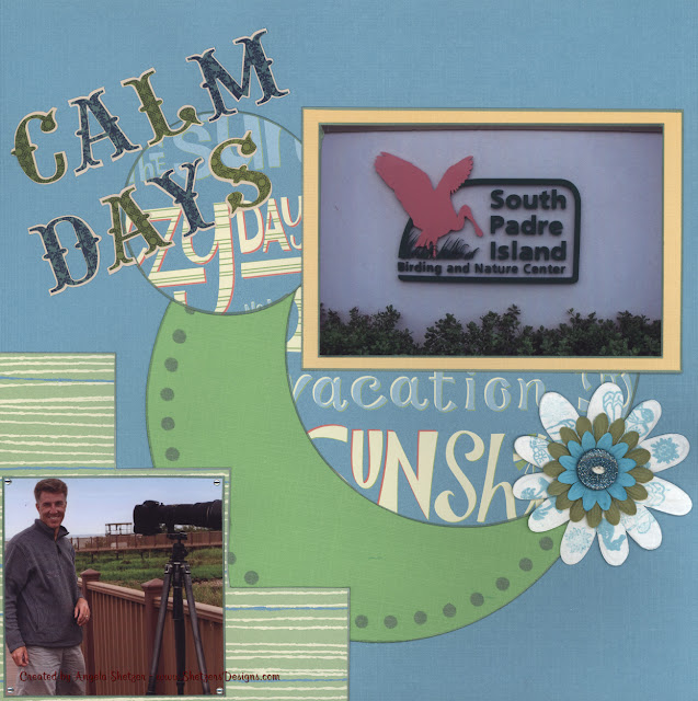
Calm Days

No matter how many flowers I purchase, I never seem to have the right color so I decided to purchase quite a few of the cream colored paper flowers.  With these, I can use either glimmer mists, stamps, or ink to recolor them to the perfect color.  In this layout, I wanted to match the blue and green and my stash of flowers just didn't have the right shades of the color.  A little glimmer mist created the green flowers and the blue ones were created with the help of stamps and ink.  Perfect match for this double page layout!!


CALM DAYS - April 2010 - South Padre Island, Texas
 JOURNALING: One of our favorite places to visit on calm days as the Birding & Nature Center.  We enjoyed the beautiful board walks and the peaceful setting watching the various birds and the alligators.

SUPPLIES USED:  Day at the Beach by EK Success, George & Basic Shapes Cricut cartridge, Sketch by: Mary Yountz, Summer Cardstock by DCWV, Inkadinkado Coastal stamps, Stampabilities blue ink, Glimmer Mists

Close up of Page 1 - Click on image for larger size

Close up of page 2 - Click on image for larger size

Wednesday, June 8, 2011

Register now for Scrapbooking & Notecard Classes

Just a reminder that I'll be teaching both scrapbooking and notecard making at this years annual Bald Eagle Festival in Haines, AK in November.  If you have not experienced the beautiful Alaskan landscapes with thousands of Bald Eagles, this is your chance.  This is a great opportunity to get some fabulous photos to scrapbook as well as get some instruction on scrapbooking and a lot of great notecards to send to fammily & friends.

For some sample photos of the Bald Eagles around Haines, visit our photo gallery website.

For more information or to register, please visit the American Bald Eagle Foundation's website.


Monday, June 6, 2011

CATCH A WAVE - April 2010 - South Padre Island, Texas

One of the drawbacks of using a dark background paper is that it can make your photos appear darker and less apt to "pop" off your page.  While my photos of my wonderful husband kiteboarding were very bright, I felt they needed a little more distinction from the dark black paper by DCWV.  I grabbed my white Sharpie Paint Pen and edged the photos with it.  I was able to achieve the distinct boundaries that I was looking for without having to add another layer of paper to my layout.  Overall, it was cheaper and had the same effect.  I am always up for saving my supplies and creating the same look in a multitude of ways.

CATCH A WAVE - April 2010 - South Padre Island, Texas

Page 1 detail

Page 2 detail

SUPPLIES USED:  chipboard, Cricut Expression, Graphically Speaking, paper ribbon, Sharpie Paint Pen, stickers, Tahiti Stack by DCWV

For more SUMMER themed layouts, please visit my online gallery at Shetzers Designs

Thursday, March 17, 2011

OVER THE MOUNTAINS AND THROUGH THE WOODS

I finally finished my last layout of our trip through Canada to reach Alaska in July of last year.  Now I get to start on some of our wonderful Alaska Photos and continue with the Bald Eagles.  I love this paper pad from K&Company, it has such fun cutouts and papers.  Its a departure from my normal colors, but that is what makes it fun.

OVER THE MOUNTAINS AND THROUGH THE WOODS... - July 6, 2010 - Dawson City, Yukon, Canada
JOURNALING:  To continue our drive on the "TOP OF THE WORLD" highway into Alaska, we had to start out on the small ferry.  We fit - but just barely.

PHOTOGRAPHS:  Angela Shetzer of Shetzers Photography {http://www.shetzers.com}

SUPPLIES USED:  K&Company Road Trip patterned paper and embellishments, Nick Bantock's Charcoal Grey ink by Ranger, DCWV Cafe Mediterranean cardstock, Bazzill Just the Edge borders, Inkadinkado Travel Words & Road Trip stamps, Hero Arts Travel Frames stamp

TECHNIQUE NOTES:  I used a mat that I had torn the edges to ink the large borders on the photos.  I applied the ink with a sponge to give nice even coverage.  Once the ink was dry, I sanded the edges of the photos with sandpaper to distress them and help them stand out against the matting.

Here are the close up details of both pages...